In the world of business, your brand is the cornerstone of your success. It's what…
Re-Energizing the brand: Parkway SleepHealth Centers
When we first met the Parkway SleepHealth team, they had come a long way since their initial launch years earlier, but it was time for a brand makeover. We were hired to assist with a brand refresh, and, subsequently, with marketing support, creative development and project management.
The first challenge the client faced was that both the business name (then Parkway Sleep Centers) and logo design encouraged their audience to think “mattress store” rather than “medical center specializing in sleep health.” Their existing logo also had similar lines to Tempur-pedic’s (though in no way infringing on it), and an emphasis on “Parkway” that implied that their main differentiator was location.
The client changed its name to Parkway SleepHealth Centers, and its tagline to “Sound sleep. Sound health.” Once that was decided, we helped create a complete corporate rebranding that’s helped bring their overall brand in line with the advanced, comprehensive facility they are today.
The Marketing Machine team approached the redesign of their logo with several goals in mind:
• Emphasize the client’s unique selling proposition: Expertise in sleep health overall, not just a narrow portion of the field (such as sleep apnea, CPAP equipment or providing sleep studies), as do many of their competitors. We increased emphasis on sleep health.
• Communicate serenity and compassion, and suggest the results of a good night’s sleep: The ability to gladly greet the day. We added colors and sun/sunlight.
• Don’t be boring! And don’t look like anyone else!
Here’s the before and after:
![]()
Once this was approved and the color palette was established, we proceeded to update all the elements of their corporate branding package: business cards, letterhead and envelopes, presentation folders, interior and exterior signage for the office to help guide incoming patients, and booth graphics for business expos and meetings. “Compassionate, clean and bright—but never boring” was our mantra every step of the way.
The next phase in the rebranding process was to help the Parkway team communicate its services and benefits across the “Triangle” region of North Carolina in ways that would build brand awareness. This is where having a team with both branding and marketing expertise is helpful.
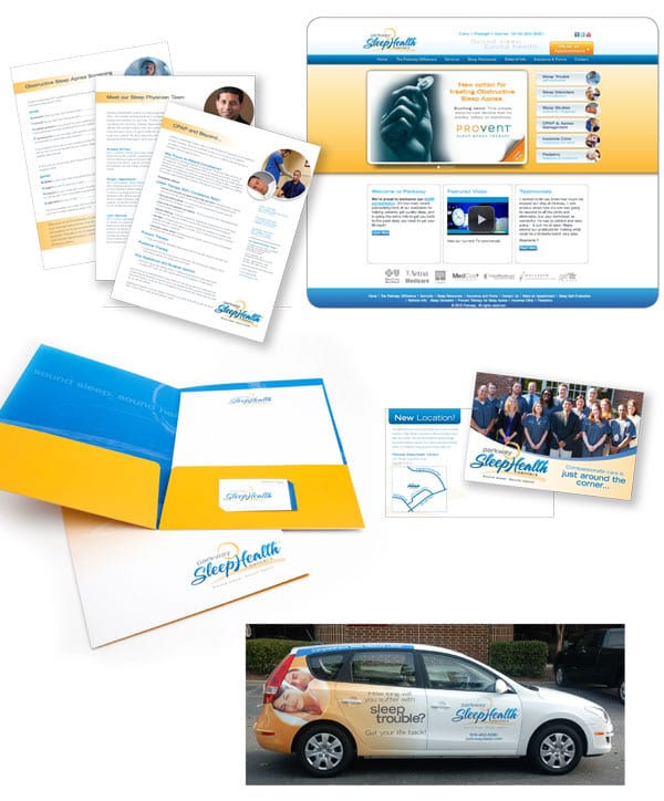
The client planned to market both to referring physicians and—in a new effort made possible by the addition of a medical director to the staff—directly to patients, so we recommended versatile tools that could be assembled according to interests and knowledge levels: An overview booklet for patients, consisting of a set of mix-n-match sales slicks that could be cherry picked according to audience.
We also worked closely with them to update the website to be consistent visually with the new brand’s look and feel, as well as to reorganize the navigation and functionality. Visit Parkway’s new site and you can learn a thing or two about why and how people with sleep disorders can get relief!
Related Posts