In the world of business, your brand is the cornerstone of your success. It's what…
My top 10 most loathed fonts as a graphic designer!
All graphic designers have a love for typography. It’s what we do! But not all typography makes us feel all gooey inside. Fonts also follow fads just like everything else does. Some fonts that were cool in the 80s, should be left there, tied up, drawn and quartered… and then shot a couple more times.
With so many amazing font designers out there today, there are plenty of choices to choose from. When designing a logo, the most important piece you will start with is the font. In the case of logo design, some of these are called the “worst” because the fonts are mostly overused across multiple mediums for the wrong reasons. Because of this, these fonts have lost its distinction and are perceived as gaudy, cheap and ugly.
Below is my “current” list.

10. Courier
This is just one of the ugliest fonts every created! Period! If you are writing code, a screenplay or something that needs to have major readablility, stay the f*ck away from this font!
Alternates: Cousine, PT Mono, Helvetica

9. Trajan
“In a world…”
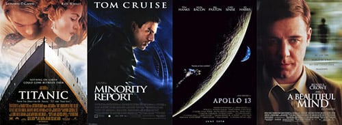
This is font that has been brutalized in movie posters and movie marketing materials. From Titanic to Minority Report to Apollo 13 to A Beautiful Mind. Even though Trajan is a beautiful font, it is shipped with every copy of Adobe Creative Suite and thus has been overused in design for years.
Alternates: Revista, Perpetua, Aviano Flare

8. Copperplate Gothic
If I see another law firm/accounting agency/corporate business use this font in their branding, it’ll be too soon! If you want to look like everyone else, go for it!
Alternates: Bolt Engravers, Medio, Revista Black

7. Bradley Hand
Besides Comic Sans (we’ll get to that one later, trust me), this is hands down the most overused font for invitations, school announcements, storybooks, or your kids’ bar mitzvah. I love a good handwritten font just like the next guy, however, Bradley Hand looks nothing like handwriting. I won’t even offer a suggestion for an alternate font to use because they are to implement with any other design elements.

6. Arial
Arial was once the standard font in all Microsoft applications, thus making it the go-to font for amateur and non-creative designers. Thank God they’ve replaced Arial with Calibri as the default font in Office 2007.
Alternates: Gentona, Avenir, Myriad Pro

5. Times New Roman
I read an article recently that said “Using Times New Roman is the typeface equivalent of wearing sweatpants to an interview”. Microsoft used Times New Roman as the default for Word, the most popular word processing software, until 2007. There are so many better san serif choices out there, just scroll past this one… please!!!
Alternates: Perpetua, Goudy Old Style, Hoefler
The next 4 fonts I obviously hated so much, I didn’t even have them installed on my mac. I had to search for them and install them for this post. LOL!
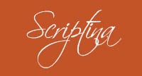
4. Scriptina
I remember the first time I saw this font back in 2004. It seemed like such a fresh take on a script font. It had pizzazz and personality. Now it is quickly becoming more overused than Helvetica! That’s hard to do! The cool factor of this font is long gone and now when I see it being used in a logo or other branding, I wonder what the designer was thinking when they chose that font. You really can’t take a company very seriously when they use a font like this.
Alternates: Indie, Alpine Script, Amorinda

3. Hobo
The Dukes of Hazzard called and they want their font back.
This isn’t necessarily an overused font but I literally cringe anytime I see it used in design. Hobo got its name because it was nameless for so many years. Before it was published, it became known as “that old hobo” to the designer Morris Benton. Fifteen whole years later, Benton got around to publishing Hobo.
Alternates: Any creative font that was designed after 2010.

2. Papyrus
This particular font face was designed in 1982 by Chris Costello, (who himself admits that Papyrus is overused). It was designed to mix the distinctive characteristics of Roman characters with the drawn look of beautiful calligraphy. And it does both of those things rather well. But while it might be a well designed font, it is not a good font at all. And if anything it’s almost as overused as Comic Sans.
Overly tacky, gimmicky, a single use font that you see on the signs of hippy shops and in places trying to seem “cool” and “well designed”. I see this in your logo, I don’t enter your shop. God, you could not pick out a worse font if you tried.
There are even sites dedicated to the overuse of this font such as papyruswatch.com/. To take it a step further, Graphic designer Ben Harman combined the two generally loathed typefaces Papyrus and Comic Sans into the font Comic Papyrus. LOL!
Alternates: FF Clair, Palatino Sans Informal, ITC Cancione

1. Comic Sans
‘Comic Sans looks like someone threw up on their keyboard and that’s what came out,’ says graphic designer Dave Combs. So much has been written about the cult-hate for this type.
In 1985, Vincent Connare, who was working at Microsoft at the time, designed the font for the digital assistant Microsoft Bob, a comic software package designed for kids. Remember those friendly little cartoon assistants that used to help you out on Microsoft Word?You know, the ones that would pop up and say, “Looks like you’re writing a letter. Would you like help?”
While Microsoft Bob didn’t last, Comic Sans became a font option on Windows 95 and quickly gained popularity among young children in primary schools and other childcare organizations. Years later there is a je ne sais quoi, an aesthetic, even visceral reaction to such an astoundingly ugly font. Why does everyone love to hate Comic Sans? Because it’s the worst font ever!
Alternates: Verveine, Bubblegum, Caper Comic
These are really just a handful of fonts that make my eyes bleed! Being a senior designer with 20+ years experience, I can tell you that I have some authority on this topic. I love type and there are new fonts constantly being created. Set yourself and your business apart from everyone else by NOT using any of these 10 fonts for your branding…or I will smite thee on thy right cheek!
Aaron Price “The Font Collector”
Related Posts