Your brand is more than just a logo or a tagline—it’s the essence of how…
20 Examples of Rebranding and How Logos Evolved
In light of our recent post about rebranding, we thought we would show you some examples of logo evolution. Although rebranding is a lot more than just a logo redesign, this is where it starts and if you don’t nail it at this stage of the game, you might fail to achieve the results desired from your rebranding campaign.
Changes Don’t Have To Be Radical
One thing to keep in mind is that rebranding doesn’t have to be 180 degrees from your current brand. Your company’s look might just need to be freshened up to keep with the times and latest styles. It’s important to appear current and hip to the trends with your client base, and a stale, stagnant corporate identity is not going to achieve that.
Businesses need to show evidence of being alive—businesses learn, grow and evolve just as people do and their visual personality needs to reflect that. Branding evolution allows you to stay connected with your customer. People should be able to identify with your brand and even take ownership of it. If your customers can’t connect with your brand, you will not get your message across to them effectively. To succeed at this, you (or your marketing team) must be alert and open to design trends.
Maintain Brand Recognition
On the other hand, while switching things up for your identity, you don’t want to lose the brand recognition that you have spent so long establishing. Unless your company is going through a major change such as a merger, or you are doing a brand change due to trying to shake a bad rep, then you should want people to know it’s still you. In most cases, you want to keep the major elements of your brand and just do some tweaking.
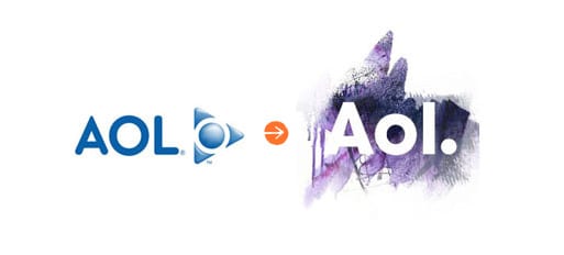
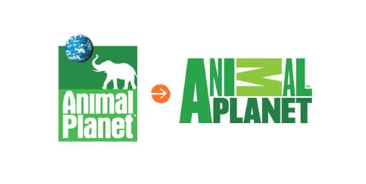
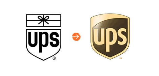
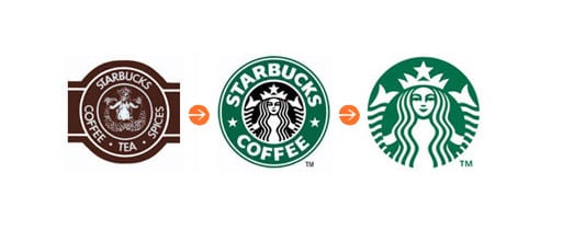
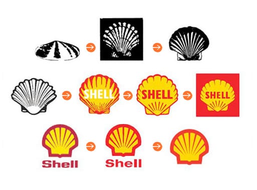
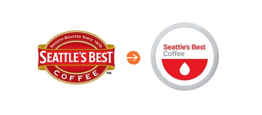
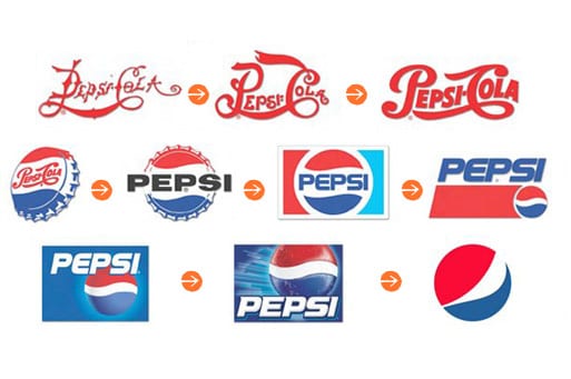
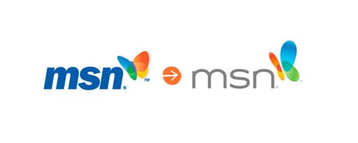
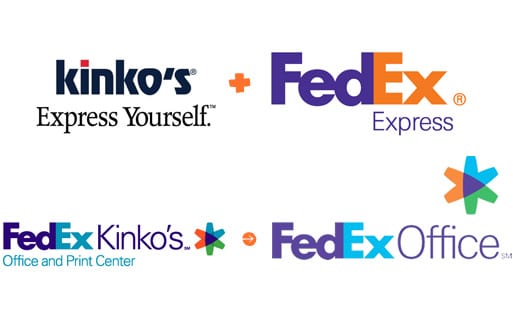
Notice in the examples below how the company colors usually stay the same, and it is mainly the design elements that are freshened up. The FedEx Kinkos merger is a good example of the effect a merger has on branding. You can see how FedEx gradually dropped Kinko’s brand completely from their image and remained recognizable as the FedEx brand throughout the transition.
Logo Evolution
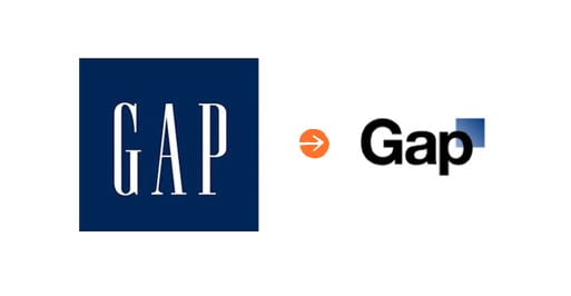
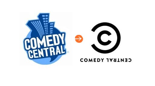
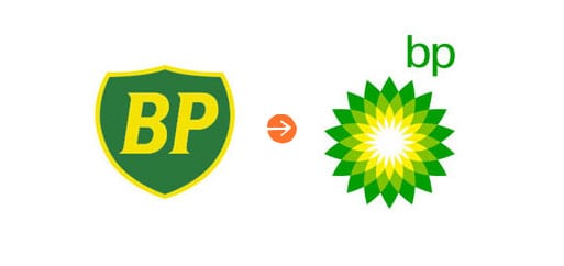
Check out the examples below… We threw in our own logo evolution at the end!
Do you think all of these logo re-designs are improvements or are some a step back? Imagine if Apple still used their first logo from 1976 and never evolved their image… how would we view their brand differently today?
For more information on how these examples of rebranding could inspire a new look for your company, please contact us today to schedule a consultation.
