CUSTOM WEBSITE DESIGN FOR MAXIMUM BRAND IMPACT In today's digital world, having a unique, and…
To wireframe or not to wireframe? Or, how to design a website.
Website design is attempted by many, but even just five minutes browsing the Internet proves that there is more bad design than successful design. Many people and companies think that as long as they have a website, they’re doing well for themselves. Well, yes, we think it’s absolutely essential to have a website in this day and age, but having a terrible website, a site with ambiguous navigation or a site from ‘99 that you haven’t updated since it first went live might actually hurt your business. It might be better to just take it down until you have the means to put up something that will benefit your company. If I come across a website that is embarrassingly bad, I immediately judge the company and write them off as a company I don’t want to be involved with, buy from or use their services. That may seem harsh, but we are constantly making subconscious judgments all day long about everything we see, and if we see a bad website, we associate those feelings with not trusting the brand or feeling like they don’t care about their business, so why should we?
That being said, how do we design a website so that it’s as successful as it can be? What steps do we take in web design to ensure that the goals we set forth are accomplished? Well, you can’t just buy a copy of Adobe® Dreamweaver and call yourself a web designer, or find a template online and fill in the blanks. Professional web designers know there are distinct steps that must be taken in order to ensure complete success. There’s no way around it. Here’s our version of those steps:
1) Defining Objectives
This step involves meeting with the client to determine what they want out of their website and how we will measure their success. Do they want a form to be filled out to get a lead? Do they want their menu to be displayed or downloaded? Do they want their coupons to be downloaded? At this stage of the game, you must determine the most important calls-to-action needed and how to measure these goals. What’s the purpose of your website and what audience are you trying to reach? Are you trying to sell something or just make sure your potential customers see all of your 5-star reviews? Does the client need access to the site so they can change/update content or add photos on their own? A lot of questions must be answered in the beginning. We use a checklist that helps us cover all of our bases to ensure that we determine the goals we need to meet and the path we need to take to get there.
2) Wireframing
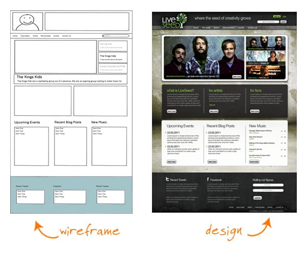
What is a wireframe, you ask? A wireframe is a blueprint or visual guide that represents the framework of a website, how it will function and where elements will be placed on a page. Many web designers skip this step, but especially with bigger websites, this step is very important. Not using a wireframe is like building a house without setting the foundation and the skeleton. Getting a wireframe approved takes much less time than getting a design approved, and making changes to a wireframe is nothing compared to making design changes. Not seeing images, color and other design elements at this stage helps the designer and the client really just think about usability. What’s the information hierarchy like? What buttons should stand out more than others? How much space should we allot for body copy? Where should the calls-to-action fall? Once all of this is established, the end result is a smarter, more thought-out design that’s easier to navigate and works better for both the user and the client.
3) Design
This is where you give the wireframe it’s skin, it’s personality. If the client already has well-established and successful branding, then a good designer brings that to life in their website and really ties everything together. If this is a new client or they haven’t thought through their website goals, or if they have no branding at all in place, this is where mood boards come in handy. A mood board is sort of like a collage of imagery, color palettes, design elements and inspiration that set the tone of the website. If we think that a client is in need of this step, we will give them two or three mood boards with different directions and styles, which allows us to get a feel for what they respond to and the direction in which we need to go. This is a really fun process, and it helps the client feel like they’re more involved. Something like a Choose Your Own Adventure® book.
4) Developer Collaboration
In order to keep the design and the development teams all on the same page, we collaborate as much as possible, right from the beginning. For example, we work together on the wireframing, and revisit the design again when it’s been completed internally before showing the client. This way, we can make sure our designs will translate to the web and our vision can come to life without exceeding the client’s budget. During the design process, if we find it would be super cool to include a feature that will exceed the client’s budget, we may present it, but with a budget-friendly alternative as well.
5) Development
Once all pages have been designed and approved, they go into development and the website really comes to life. The average person doesn’t know or care what goes on behind the scenes of a website to make it work. In fact, there are many ways you can develop a site and it will be hard to detect the difference with the naked eye. But we can’t stress enough how important it is to use clean, validated and current code. We won’t get all nerdy on you, but it’s so important to have developers who know what they’re doing. Otherwise, you can be compromising your security, your site’s longevity and your search-engine results. Once the code is complete, we have a round of internal review to make sure it’s all working in the way we envisioned, and then it goes off to the client for review before going live.
6) Analytics & Maintenance
A very common mistake in the web development world is that after a company has shelled out the money for a new website and gone through the whole process, they just want it to go live and sit back and wait for customers to start calling without ever revisiting the website. Immediately upon going live, analytics must be in place and goals and conversions must be set up in order to monitor how the website is working for you. Keeping a close eye on your website’s analytics can make the difference between having a website that works for you or a website that is just… there. You must be willing to respond and adapt to the ever-changing world of web and see what is working for you and what isn’t. You must be willing to view your website as a living entity that must grow and change and keep up with the times. Keeping content and graphics fresh will help you, not only in search results, but also with connecting with your clientele.
There you have it, a rough journey through the wonderful process of website design at TMM. We would love to hear your thoughts or how you do things differently!


