Small business owners who are new to email marketing sometimes feel overwhelmed or confused by…
Capture more business with successful landing page design
What is a landing page? It’s a very simple, single web page that’s designed to capture leads and convert site visits into sales. The goal of landing page design is to be eye-catching, straightforward and intriguing in a way that the visitor will feel enticed to learn more, pick up the phone and call you, sign up for your mailing list or take whatever call to action that you’re aiming for. Landing page success can be measured by analyzing the click-through rate to determine whether the page is working. If you have the time and resources, designing two visually different landing pages with the same content can clue you in as to what is and isn’t working by reading analytic data.
When designing landing page content, take the viewpoint of the user and ask yourself these questions:
What’s being offered and what’s in it for me?
Eye-catching graphics that grab the user’s attention and clean, organized content that’s easy to sort through will ensure that what is being offered is clearly defined. The user should have a clear understanding as to what the offer is immediately upon landing on the page.
What are the benefits and why can’t I live without it?
Answer this question by using bullet points and other quickly visible benefit highlights so the user is intrigued to learn more and take action. They have to feel like they can’t turn this offer down.
Why do I need the offer NOW?
You can create a sense of urgency to act right away by extending an offer with an expiration date.
How do I get the offer?
When designing your call-to-action, make sure it’s clear, visible and lives above the fold. You want that to be one of the first things to jump off the page as soon as someone lands on it. You can use photos that draw your eye to the call to action, arrows, color contrast and/or white space—anything that will lead the visitor’s eye to it. The trick is to do this in a way that isn’t too loud or cheesy, and is more of a subliminal path that the user feels they went on without being forced.
………………………………………………………………………………………………………….
Follow up
Make sure there’s a follow-up plan in place, such as a prompt email, phone call or any other method to ensure the lead is acted on to convert to a sale.
General Design
In addition, general design elements should be considered in order to stay within your business’ current branding and style efforts. Make sure your landing page design is seen as a simplified version of your website design, maintaining your company’s identity and branding. You want to take every opportunity to use brand recognition to your advantage.
Case study
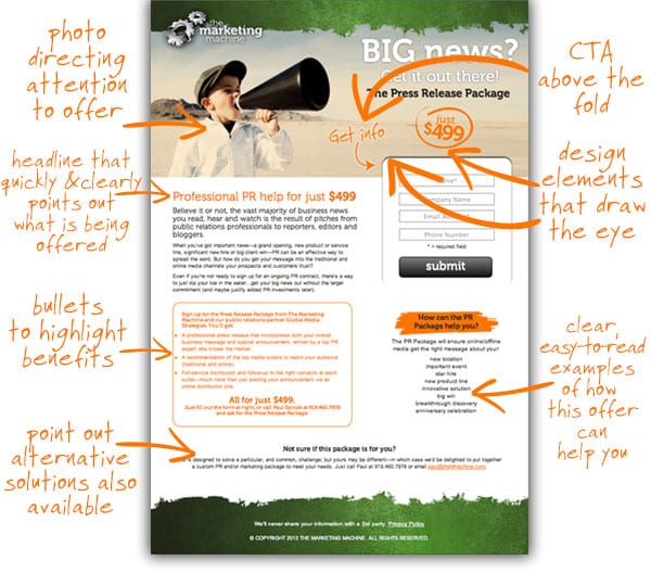
In our example below, you can see one of our landing pages. We kept in line with our branding, while simplifying and directing attention to the main headline and CTA. We used bullet points to quickly define the benefits and we made sure to include information for people who might need a different plan. Also including a privacy policy statement takes away some of the hesitation in filling out an online form.
………………………………………………………………………………………………………….


