In the world of business, your brand is the cornerstone of your success. It's what…
“Where does Pokémon get its “Go”? A Look at Rebranding Nostalgia
Pokémon exploded in the nineties. Pixelated monsters decked out backpacks, notebooks, and, of course, Gameboys. It was a cultural icon, with its logo slapped on everything and with kids drooling over the next new monster. Wars were waged over the best starter to use (Charmander, of course) friendships forged over a good trade and rascals rushed home to catch it on T.V. Of course, kids aged and fads passed. Many still loved Pokémon, but its day as icon supreme were over—until PokémonGo.
In 2016 PokémonGo made its debut—and what a debut that was. Within days it was a world-wide phenomenon. Those of us who grew up with Pokémon were kids again, arguing about which team was the best (valor, obviously), yelling hunting tips at strangers and wandering wildly in attempts to catch’em all. In short, PokémonGo was a masterpiece of rebranding.
So, let’s break it down. What did PokémonGo do that made them so successful? The obvious answer is they used an innovative technology to bring new life to an old, beloved, product. The question is: “what role did their branding have in their success?” The answer? A lot.
By mimicking the original game’s logo, the PokémonGo crew (Niantic) was able to market to old-school fans and new at the same time—all with little effort on their part. After all, the original brand was already designed to catch children’s eyes and was recognizable to the adults that had once played it.
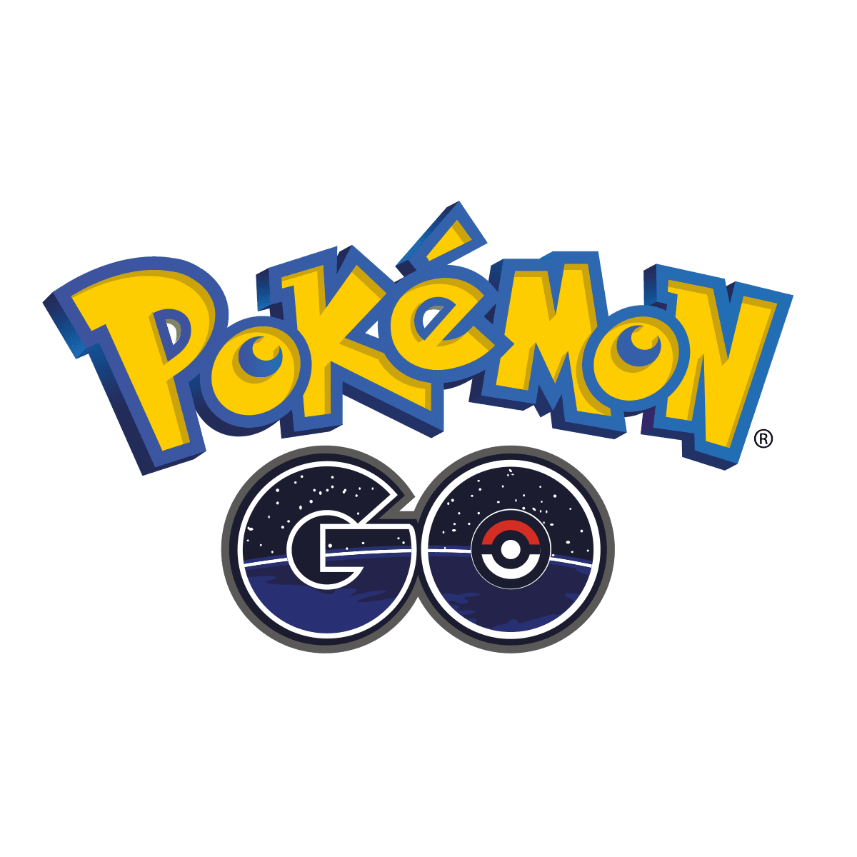
Let’s look at the PokémonGo logo for a second.
Now let’s take a look at the original Pokémon logo.
They knew that the Pokémon logo was iconic, its font and color combination was ingrained in people’s heads. Kids that had played that game could see that logo and instantly know what it was. Best of all, the work on figuring out what shapes and colors would appeal the most to kids had already been done for them! It was a no-brainer to incorporate the original logo into their rebranding.
So, how did Niantic make the “Go” part of PokémonGo iconic in its own right? It wasn’t easy. They had to find a way to stand out while blending in, a way that would make those two simple letters identify their new game all on their own—and they did it.
First off, they added an iconic element from the game into the new part of their logo. They put a Poké-ball in the middle of their “O”. For those that had loved Pokémon, the little red and white ball was instantly recognizable. For those that hadn’t, it was still visually appealing.
They didn’t stop there though. Next they moved on to the shape of their words, the font (a text similar to Bauhaus Heavy Outline) mimics the original Pokémon text’s bubbly shape—while being more stream-lined and projecting an air of modernism. They even outlined it in a very similar way to the original Pokémon font. Yet, the black and white outline around “Go” brings a subtle sophistication to the child-like font. In short, they worked hard to blend adult sensibilities with childish fun. By doing that, they were sure to catch the eye of their main customer base—the adults that had loved to play Pokémon as children.
For those that have played PokémonGo, the space background inside of the “Go” is reminiscent of the one that is used in the game itself. By putting a bit of themselves in the logo, they ensured that customers would easily recall their game, just by looking at it. On top of that, space has always been associated with innovation, technology and being just plain cool—three things that PokémonGo has done well to tie itself to. Within the span of two letters, Niantic was able to declare their brand as something that was, while tied to Pokémon, unique and identifiable in their own right.
Even if you’re not a 90s icon that can pull on kids-at-heart strings, there’s still plenty of lessons to take away from PokémonGo’s success.
- Lesson one: simple as it seems, the first lesson to take away from their rebranding is to know your market and know what you’re selling. Knowing who your market is and what brand best reflects your product while attracting them is key and is something Niantic did very well.
- Lesson two: keep it simple—but complex. The PokémonGo logo overall is a simple cohesive whole—but the elements that make it up are complex. You’ve got to find a way to combine these two opposing elements to make an appealing whole.
- Lesson three: Keep your brand open. Niantic knew who their biggest and easiest market would be: the original players of Pokémon. However, while they targeted that customer base, they kept their branding broad enough to appeal to a variety of customers.
- Last Lesson: they knew when to rebrand. This one is probably the trickiest, because while everyone rebrands (businesses both big and small have to do it) knowing when can be difficult. PokémonGo chose the exact right time to rebrand, and so should you.
To learn more about rebranding, when to do it, and how it can help your company, check out some of our previous blog posts like: our previous blog posts or contact us directly and see how the Marketing Machine can build your brand!


