Your brand is more than just a logo or a tagline—it’s the essence of how…
Branding: The Story of Max
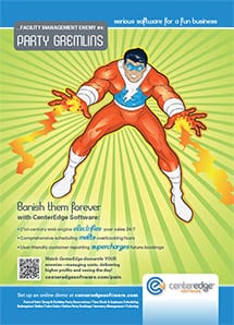
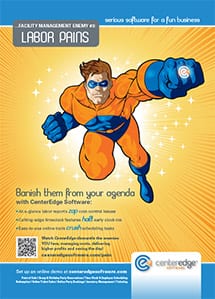
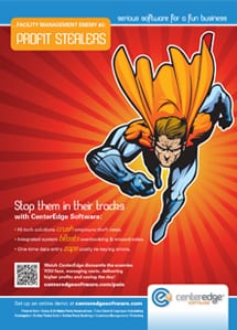
The Marketing Machine recently helped create a unique new superhero: “Max,” of CenterEdge Software. The client tasked us with developing this unique character as an outgrowth of a very successful B2B advertising campaign that we created for them in 2013; this ad series featured stock-art illustrations of superheroes that we implied were hard at work slaying entertainment centers’ worst challenges. Developing an all-new superhero is super cool, as you can imagine, so we thought you’d enjoy seeing how he evolved. Let’s set the storyline:
For years, an amazing superhero [Max] has been a largely invisible force at CenterEdge Software, working quietly behind the scenes in a tireless effort to aid small- to medium-sized entertainment centers, driving up their profitability by continually perfecting the secret weapon [a.k.a. powerful integrated facility management software] that helps owners and managers:
- stop “profit stealers” in their tracks,
- banish “labor pains” associated with the ongoing challenges of employee management and,
- defeat obstacles thrown in their path by notorious operational “time eaters”—and much more.
In 2013, Max secretly engaged these friends to be his public “stunt doubles” – giving tangible form to the impressive feats of bravery and skill at the heart of the CenterEdge team. Max assigned The Marketing Machine a critical mission: to capture their exploits and tell the world about them! [We chose to focus on cost-efficient, targeted, trade publication advertising.] Their efforts were noticed and word quickly spread, as did the client’s success, together driving CenterEdge Software to unprecedented growth. We all knew it was time for the invisible superhero to step forward…
Back in the real world, our clients asked us a really good question: “How will we make sure our one-of-a-kind superhero looks good without the cost going off the charts?” Our response: “We’ll guide you through the many development decisions with precision, ensuring the finished product captures just the right tone, and represents the brand well.”
- Our first action was to agree to a clear vision for his “persona.”
- The second (after choosing an illustrator with just the right style—in this case Rick Burnett), was creating development milestones when we could share progress with the client.
As we brainstormed, we realized that Max shouldn’t be a stereotypical bulked-up icon, he needed to be the animated embodiment of the guy-next-door-turned-superhero that we see hard at work across the CenterEdge Software organization day after day. Through these talented, dedicated people and their outstanding software, Max “accomplishes” all the amazing feats rolling out in the 2014 campaign. Here’s a short ‘n sweet version of Max’s birth (minus gory details):
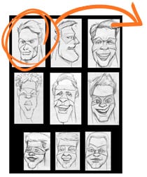
There were endless possibilities, each communicating a somewhat different personality. Our first glimpse of Max’s head included a continuum from Greek God to Goofy Stoner, as you can see at left. We unanimously felt Max was closest to the upper left. Strong and commanding…and yet, we thought he should be more accessible; someone who could be your pal once the heavy-lifting was over.
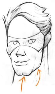
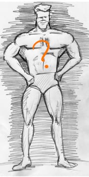
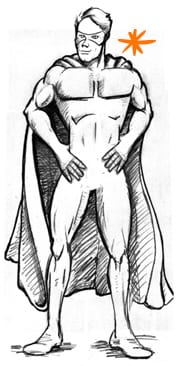
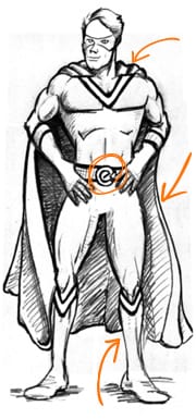
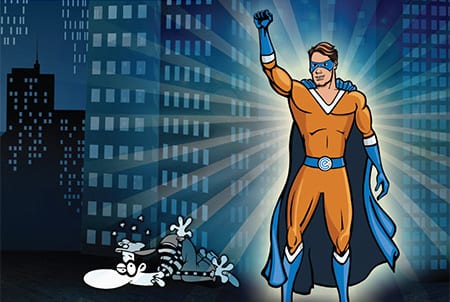
There we are: Max!

Max was approved in this iteration as a base design and style guide for the 2014 ad campaign. In each ad and/or usage, his pose and setting will change to best highlight the customer “pains” that he so easily defeats in real life, starting with this one, Profit Stealers.
Look for him at a theatre (or at least, a trade show or publication) near you!
