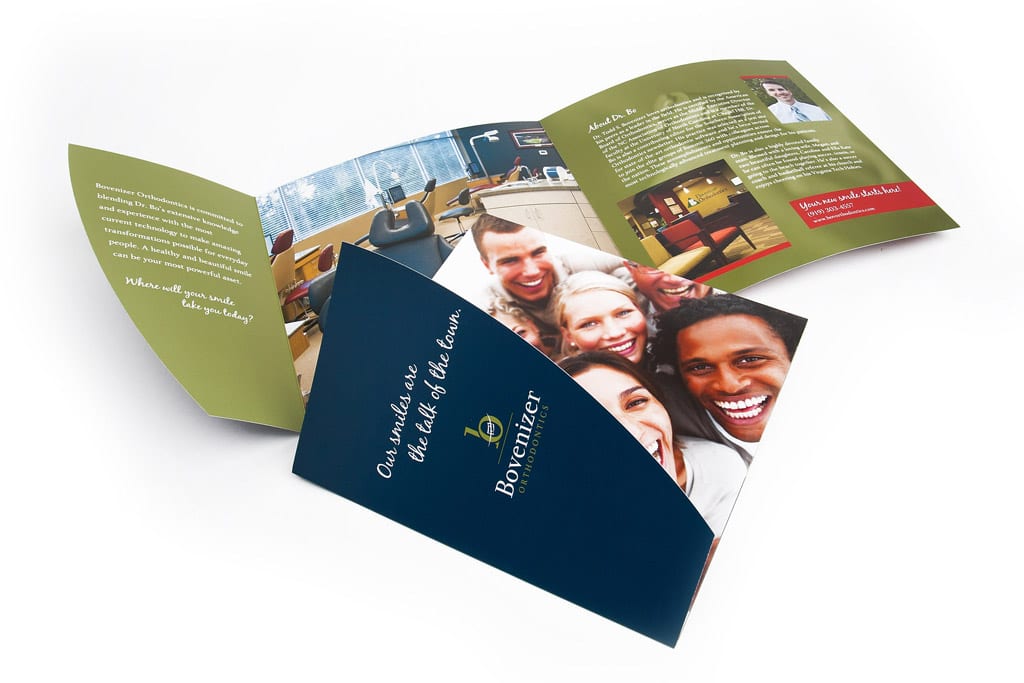
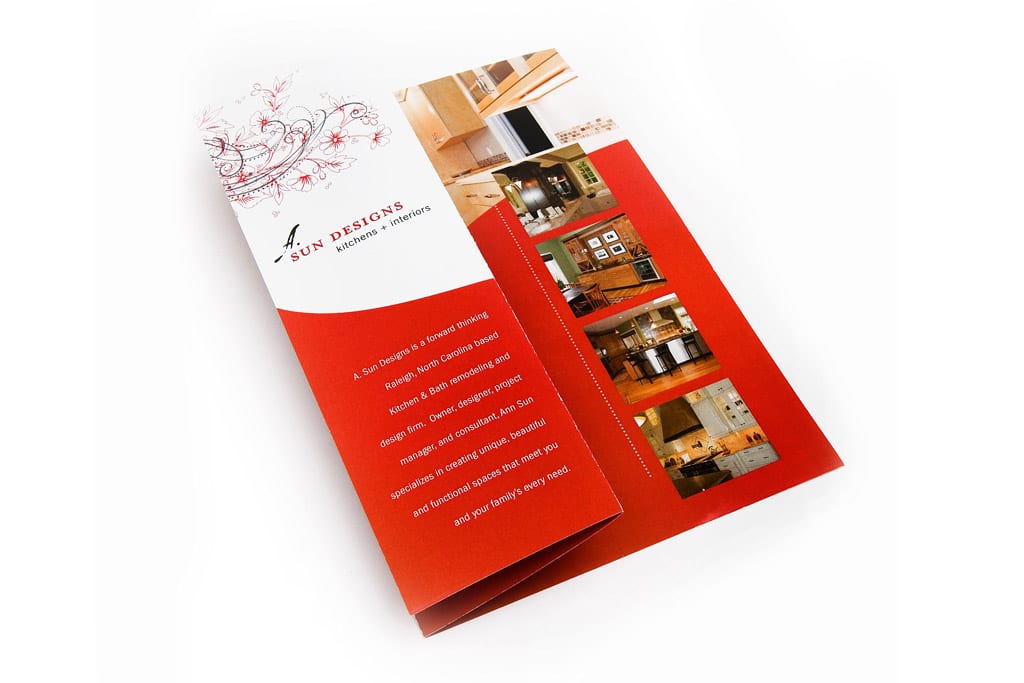
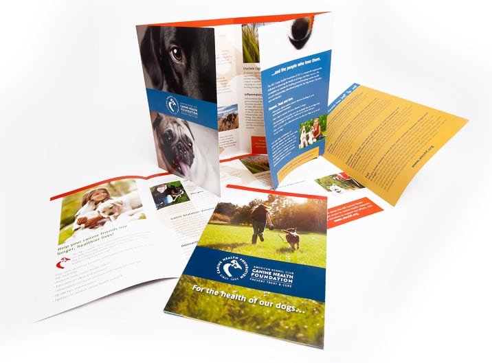
In today's competitive market, creating a strong visual identity is crucial for businesses looking to…
There Is No STANDARD When It Comes to Brochures
Just like a brand, a brochure should be as unique as the company it’s representing. A simple trifold or “rack” brochure just will not do anymore. You have to stand out in a crowd, not just in what you say or how you say it, but in how your brochure looks and how it’s packaged. I’m not saying a rack brochure is out of the question in all cases, especially if there is a display rack that it must fit into, but don’t let the container be your guide.
As a rule, I shy away from 8.5 x 11 bi-fold brochures, or the slim-line tri-fold brochures…too typical, too expected. Just because it CAN be that size doesn’t mean it SHOULD be that size. Instead, take into consideration how the brochure is going to be used: mailed, handed out, displayed for others to pick up. Also think about what the best package will be for that brochure so that it makes the biggest impact on its audience.
Say you’re doing a brochure for a mechanic…what if you put all your brochure information into an 8-page car-manual size brochure instead of the 4-page letter size? It instantly says car because it feels like a manual; then with some great design to offset your message, your brochure becomes something memorable, not just “another brochure” from a mechanic. The longer your target audience lingers on that marketing piece, the better chance you have of them reading it, and maybe even keeping it.
A very important part of the overall packaging of a brochure is the paper it’s printed on: maybe uncoated, rough paper for a grassroots outfit, or glossy, coated (and photography-heavy) for a new spa. The paper gives it the feel, the design gives it the look and the size, shape and folds help package it all up for that perfect presentation.
Ultimately that is the goal, of course; to have your audience absorb your message and then keep your brochure around to reference any information they might need, or just to visually remind them of you every time they see it. A brochure is a very important piece of marketing that many lump together with their collateral needs. “I’ll need a logo, business cards, letterhead, envelopes and a brochure.” Although a brochure is a bigger piece that tells people who you are, it shouldn’t be a standard collateral item; it should be a well-thought-out marketing marvel.
So next time you think, “I just need a brochure,” remember your company is not “just” another company; it’s unique and all the important marketing materials that represent it should be too.
View our portfolio for more examples of our brochure design.


